My first book!!

My first book – Bare Beauty – Southern Alberta in Winter


I am very excited to be able to share with you all my first photobook. This is offered in a hardback edition of forty pages, beautifully printed at 10 x 8.

Since moving here in 2005 I have been fascinated by the rural landscape in Winter time. Not so much the grand mountainous vistas, but more the everyday countryside that surrounds us. When the temperature drops below minus thirty everything takes on a kind of surreal quality and the underlying structure of the land becomes prominent. Among these features there are interesting minimalist compositions to be found and a real sense of peace.

Click on the link above and enjoy the frozen beauty of the rural Alberta land.

The only reason for time is so that everything doesn’t happen at once.


“The only reason for time is so that everything doesn’t happen at once.”

Albert Einstein

Shooting watches is such a wonderful challenge, to capture the detail, the mood, the character of a timepiece. The technical challenges are many, alongside the artistic and aesthetic.

Here are some that I have shot. 

 
Thanks for stopping by. If you have a product that needs beautiful accurate representation drop me a line.
 
The better the photo – the more you will sell – the higher price you can command.

Deep fakes and allsorts

I’ve been doing a lot of tabletop shooting recently which is something that I enjoy very much. Halfway through shooting one thing I had an inexplicable need for liquorish allsorts, so I put a tactical pause on what I was doing and headed to the convenience store. They didn’t have the original ones so I got a packet of knock offs which I thought would be pretty good as a stunt double. No problem right? They’re all the same?

Ok, taste test. Hmmmm. Nostalgia isn’t what it used to be. But they looked so good. So I headed back out, further this time across town. This time I’m going for the real thing. Fool me once.

Back at the ranch now, I open the packet. And I see this.

Of course I see this one first – it’s my favourite. This is the perfect fondant to liquorish ratio, plus it’s a bit coconutty. I’ll shoot it first, and then eat it. That will give me a system. So I shoot it to see what it looks like. Really looks like. Not just recognise it enough that I feel comfortable eating it. I mean LOOK at it. It doesn’t look pristine. But the taste and the texture – the resist, the crumble, the flood of sweetness and the chew is like having a time machine. I’m a small boy again at that time when these became my favourite. It was much easier then. I knew what I was getting. No trickery. 

Except this one.

This one always tricks me. It tastes like betrayal. Each bag I think that I will resist and not eat these but I always do. And it’s always unpleasant to me but I still do it.

These

are only half as good as these

but you knew that.

These next ones I don’t mind – they’re a bit like non player characters. Reliable but not exciting. I could still eat ten in a row and feel good about number ten.

And then somehow we get to the ones left in the bottom of the bag, at least in our house. These will only get eaten at some time past midnight.

So kind of a mixed bag really, some good , a small percentage evil.

Maybe it really does take allsorts.

All the small things

I wanted to write a few lines and share a couple of pictures that highlight the beautiful work of my friend and long time client Jesper Jensen. Jesper designs and makes the most exquisite jewellery in a style that is very much his own. I have shot many pieces for him – the ones below within the last couple of weeks.

Before I begin a job we’ll have a conversation about the piece and share ideas. I am very grateful for the creative latitude that that Jesper allows me in staging and shooting his work.

These glasses are a one-off design made from titanium. They are incredibly lightweight and very stylish.

This is a five light setup with the glasses suspended on fishing line which was removed in post. Interestingly the nature of the glass gives it this slight pink edge, which I really like. This final shot is a focus stack of thirteen nearly identical images.

There is something magical about this coming of age commemoration piece. When I see it I think of the winged keys in Harry Potter so I knew I wanted it to appear as though it was flying. This beautiful soft pink gives it the feminine tone that it needs.

Sometimes I get to shoot beautiful stones and gems such as this one. It’s an aquamarine from Sri Lanka and has these extremely unusual inclusions in it. Gem type beryl. A focus stack of something small and wonderful about the size of a very fat pumpkin seed.

This bold masculine square cut emerald ring gets a complimentary setting on green hide with the gold and green tones vibrating against each other.

The pendant of diamonds and platinum is beautiful but we should also give props to the handmade platinum chain. Each link hand cut and individually welded.

Shooting on black velvet and being very particular with the lighting allows it to shine. Literally.

For someone that is so visually driven Jespers workshop is a rich and detailed environment. I spotted this on a shelf and it caught my eye. I wanted to light and shoot it because of the dynamic shapes and textures and detail even though it’s an unfinished prototype ring hung over the detached bottom of a tiny sized anvil. Phew.. It interests me to look at this picture and I deliberately shot it in such a way as to raise doubts as to the size of it.

Thanks for stopping by, I appreciate your time and your business.

Clean and tight hits the right note for B & O

This is an image that I shot for my portfolio this afternoon. I love great design and Bang and Olufsen are almost without equal when it comes to minimal chic.

The finished image must represent the brand so I opted for this bright, technical,  minimalist art approach. A five light, five shot focus stack created here in my home studio.

Thanks for stopping by!

www.beoworld.com

How to make art for a brand when the brand is art?

Shooting eyecatching and engaging images for any brand can be challenging but what do you do when the brand that you are shooting for is art?

Below I will share how I approached shooting promotional images for internationally acclaimed equine artist Shannon Lawlor and also share some of the beautiful pictures that we made during the day. Jump over and take a look at Shannon’s incredible paintings and drawings at her website.  

A great start

I have shot with Shannon a couple of times before – once when she was featured on the cover of Routes magazine and then again two years ago. It is always a fun and productive time so when she called me to discuss heading out on a road trip I was immediately excited. She began to collect images and ideas that would serve as inspiration and we passed some ideas between us. It was obvious that she was looking to make photographs that would be visually striking and would represent her brand authentically. 

Location location location


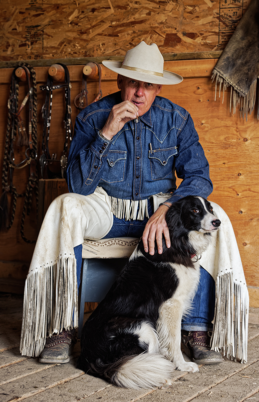
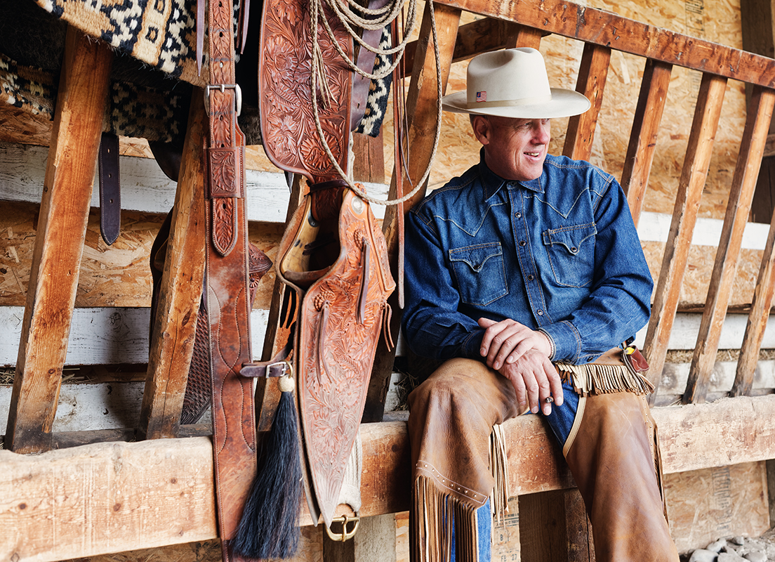
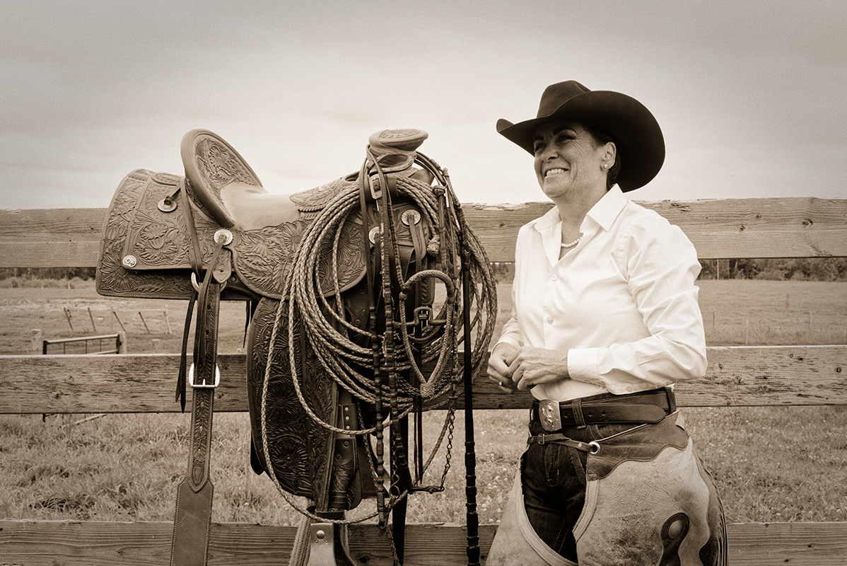
Our kind and gracious host for the day was Bruce Campbell, owner of Eagle Hill Equine

I was fortunate enough to be able to shoot a few frames with Bruce during the day too – thank you so much Bruce! It was a fabulous day.

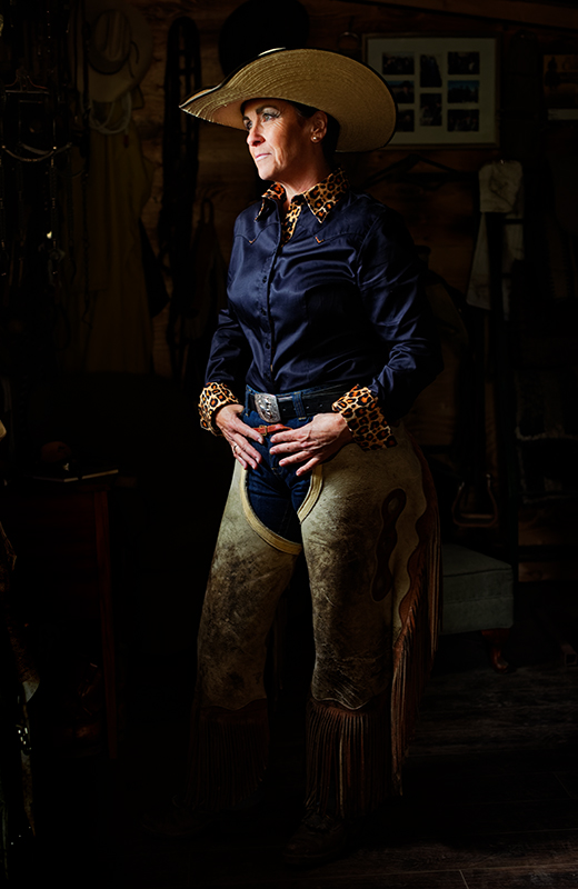
Natural and beautiful

There is something very freeing and exhilarating about leaving all the lighting gear in the truck and shooting with whatever is available. Movement is easier, conversations flow back and forth. Of course the light has to be present in some way that will work for you, and you have to be able to read and interpret the light with fluidity and confidence. On this day the light outside was completely flat which would mean very flattering soft portraits but could also mean flat and dull images. The key is to use the environment to shape the light and to find contrast that will help tell the story.
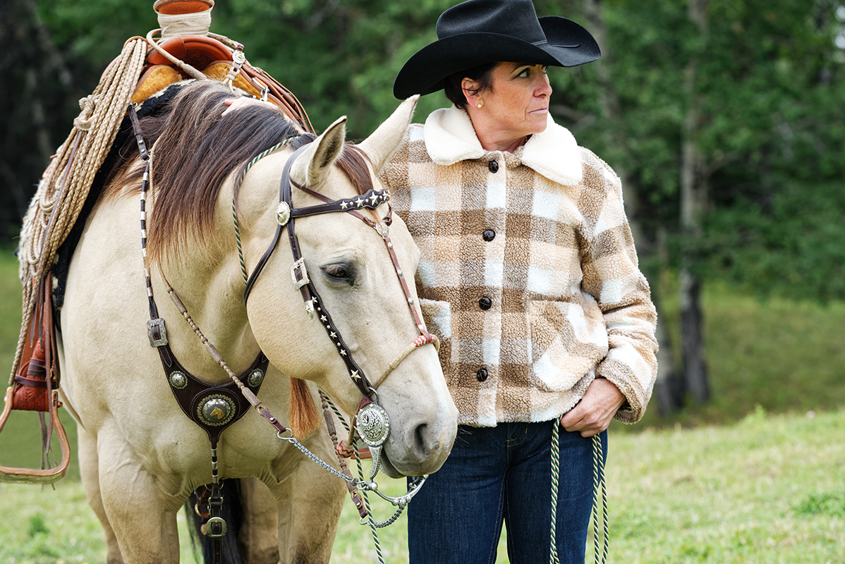
 

A wider perspective

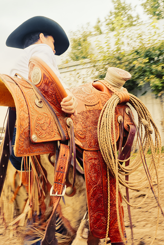
We made quite a few striking images in the entrance to the barn and in the tack room which in itself could have provided beautiful texture rich photographs all day. However our intention was to capture images that would work across different platforms and times to maintain the brand image. We moved outside into pasture where we were able to shoot with Sadie (the horse). I snapped a couple as tack was being moved which work well to convey energy and narrative due to motion blur on the parts that were moving fastest across the lens.
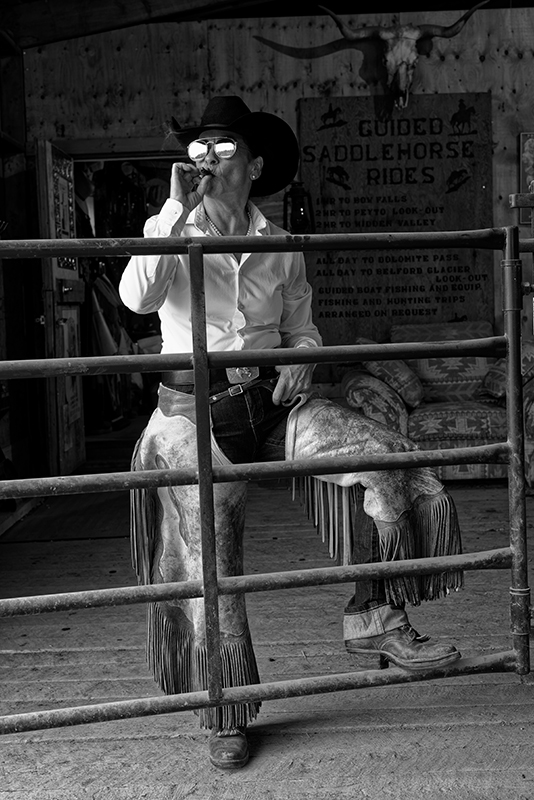
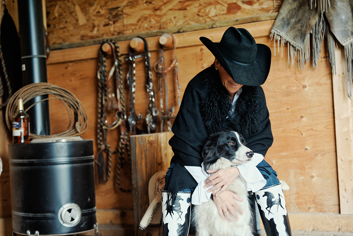
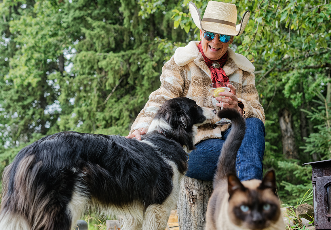
The cats whiskers

We rounded out the day in a very relaxed style.

Which the cat didn’t really like. Apparently.

It’s a wrap

We finished the shoot both happy with the shots and how we had worked towards our original vision in a way that felt natural and fun. There are many good images from the shoot and in time I hope you will get to see some more. 

Go check out Shannon’s website. 

Follow her on social media and please like and follow my social feeds and please also consider sharing this blog post. Check back if you enjoyed this post as I will be blogging regularly once again.


Thanks for stopping by.